151. [HarmonyOS NEXT 实战案例十二:List系列] 卡片样式列表组件实战:打造精美电商应用 基础篇
原创
151. [HarmonyOS NEXT 实战案例十二:List系列] 卡片样式列表组件实战:打造精美电商应用 基础篇
原创
全栈若城
发布于 2025-06-30 22:45:13
发布于 2025-06-30 22:45:13
HarmonyOS NEXT 实战案例十二:List系列 卡片样式列表组件实战:打造精美电商应用 基础篇
项目已开源,开源地址: https://gitcode.com/nutpi/HarmonyosNextCaseStudyTutorial , 欢迎fork & star
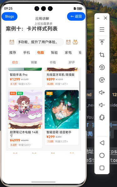
效果演示
一、引言
在移动应用开发中,卡片样式列表是一种常见且实用的UI设计模式,特别适合展示商品、文章等具有图文混排特性的内容。本教程将详细讲解如何使用HarmonyOS NEXT的Grid组件实现一个精美的卡片样式商品列表,适用于电商应用场景。
我们将从以下几个方面进行讲解:
- 卡片样式列表的基本概念和应用场景
- 数据模型设计
- 使用Grid组件构建卡片列表
- 商品卡片UI实现
- 分类和排序功能
- 底部导航栏实现
二、卡片样式列表的基本概念和应用场景
卡片样式列表是将内容以卡片的形式排列展示的UI模式,每个卡片包含独立的内容单元,通常具有以下特点:
- 视觉独立性:每个卡片都是视觉上独立的单元,有明确的边界
- 网格布局:通常以网格形式排列,可以是等宽不等高的布局
- 丰富的内容展示:卡片内可以包含图片、文字、标签、价格等多种元素
- 交互反馈:点击、长按等交互操作有明确的视觉反馈
卡片样式列表适用的场景包括:
- 电商应用的商品展示
- 图片社交应用的照片墙
- 新闻应用的文章列表
- 视频应用的视频列表
在本教程中,我们将以电商应用的商品列表为例,实现一个功能完善的卡片样式列表。
三、数据模型设计
首先,我们需要设计商品数据的模型结构:
// 商品数据类型定义
type ProductType = {
  id: number,
  name: string,
  image: Resource,
  price: number,
  originalPrice: number,
  discount: string,
  sales: number,
  isNew: boolean,
  isHot: boolean,
  category: string
}

// 分类数据类型
type CategoryType = {
  id: number,
  name: string
}

// 排序选项类型
type SortOptionType = {
  id: number,
  name: string
}
这个数据模型包含了商品的基本信息:
id:商品唯一标识name:商品名称image:商品图片price:当前价格originalPrice:原价discount:折扣信息sales:销量isNew/isHot:是否为新品/热卖商品category:商品分类
同时,我们还定义了分类和排序选项的数据类型,用于实现分类和排序功能。
四、使用Grid组件构建卡片列表
在HarmonyOS NEXT中,Grid组件是实现卡片样式列表的最佳选择。它提供了网格布局,可以灵活设置列数、间距等属性。
4.1 基本用法
Grid() {
  ForEach(this.productList, (product: ProductType) => {
    GridItem() {
      // 商品卡片内容
      this.ProductCard(product)
    }
  })
}
.columnsTemplate('1fr 1fr') // 两列布局
.columnsGap(8) // 列间距
.rowsGap(8) // 行间距
.padding({ left: 8, right: 8, top: 8, bottom: 8 })这段代码创建了一个两列的网格布局,使用ForEach遍历商品列表,为每个商品创建一个GridItem,并在其中渲染商品卡片。
4.2 Grid组件的关键属性
属性 | 说明 | 示例 |
|---|---|---|
columnsTemplate | 定义列的宽度和数量 | '1fr 1fr'表示两列等宽 |
rowsTemplate | 定义行的高度和数量 | '1fr 1fr'表示两行等高 |
columnsGap | 列间距 | 8表示8vp的间距 |
rowsGap | 行间距 | 8表示8vp的间距 |
layoutDirection | 布局方向 | Row或Column |
maxCount | 最大显示数量 | 限制显示的项目数量 |
在我们的示例中,使用columnsTemplate('1fr 1fr')创建了两列等宽的布局,适合在手机屏幕上展示商品卡片。
五、商品卡片UI实现
商品卡片是整个列表的核心元素,需要精心设计以吸引用户注意。
5.1 卡片基本结构
@Builder
ProductCard(product: ProductType) {
  Column() {
    // 商品图片区域
    Stack() {
      Image(product.image)
        .width('100%')
        .aspectRatio(1) // 保持1:1的宽高比
        .objectFit(ImageFit.Cover) // 填充模式
        .borderRadius({ topLeft: 8, topRight: 8 })

      // 商品标签(新品/热卖)
      Row() {
        if (product.isNew) {
          Text('新品')
            .fontSize(12)
            .fontColor('#FFFFFF')
            .backgroundColor('#FF5722')
            .padding({ left: 6, right: 6, top: 2, bottom: 2 })
            .borderRadius(4)
            .margin({ right: 4 })
        }

        if (product.isHot) {
          Text('热卖')
            .fontSize(12)
            .fontColor('#FFFFFF')
            .backgroundColor('#FF9800')
            .padding({ left: 6, right: 6, top: 2, bottom: 2 })
            .borderRadius(4)
        }
      }
      .position({ x: 8, y: 8 })
    }
    .width('100%')

    // 商品信息区域
    Column() {
      // 商品名称
      Text(product.name)
        .fontSize(14)
        .fontColor('#333333')
        .maxLines(2)
        .textOverflow({ overflow: TextOverflow.Ellipsis })
        .width('100%')

      // 价格信息
      Row() {
        Text(`¥${product.price.toFixed(2)}`)
          .fontSize(16)
          .fontColor('#FF5722')
          .fontWeight(FontWeight.Bold)

        Text(`¥${product.originalPrice.toFixed(2)}`)
          .fontSize(12)
          .fontColor('#999999')
          .decoration({ type: TextDecorationType.LineThrough })
          .margin({ left: 4 })
      }
      .width('100%')
      .margin({ top: 4 })

      // 折扣和销量
      Row() {
        Text(product.discount)
          .fontSize(12)
          .fontColor('#FF5722')
          .backgroundColor('#FFF0E6')
          .padding({ left: 4, right: 4, top: 1, bottom: 1 })
          .borderRadius(2)

        Text(`${product.sales}人已购买`)
          .fontSize(12)
          .fontColor('#999999')
          .margin({ left: 4 })
      }
      .width('100%')
      .margin({ top: 4 })
    }
    .width('100%')
    .padding({ left: 8, right: 8, top: 8, bottom: 8 })
  }
  .width('100%')
  .backgroundColor('#FFFFFF')
  .borderRadius(8)
  .onClick(() => {
    // 点击商品卡片的处理逻辑
    console.info(`Product clicked: ${product.name}`);
  })
}
这个商品卡片包含以下几个部分:
- 图片区域:展示商品主图,使用
Stack组件叠加显示新品/热卖标签 - 商品名称:最多显示两行,超出部分使用省略号
- 价格信息:显示当前价格和原价(带删除线)
- 折扣和销量:显示折扣信息和销量数据
5.2 卡片样式优化
为了提升卡片的视觉效果,我们可以添加以下样式:
.backgroundColor('#FFFFFF') // 白色背景
.borderRadius(8) // 圆角
.shadow({ // 阴影效果
  radius: 4,
  color: 'rgba(0, 0, 0, 0.1)',
  offsetX: 0,
  offsetY: 2
})
.stateStyles({ // 点击状态样式
  pressed: {
    scale: { x: 0.98, y: 0.98 },
    opacity: 0.9
  }
})
这些样式可以让卡片看起来更加立体,并在点击时提供视觉反馈,提升用户体验。
六、分类和排序功能
电商应用通常需要提供分类和排序功能,帮助用户快速找到所需商品。
6.1 分类选项卡
// 分类数据
private categories: CategoryType[] = [
  { id: 0, name: '全部' },
  { id: 1, name: '手机' },
  { id: 2, name: '电脑' },
  { id: 3, name: '家电' },
  { id: 4, name: '服饰' },
  { id: 5, name: '美妆' },
  { id: 6, name: '食品' }
]

// 当前选中的分类
@State currentCategory: number = 0

// 分类选项卡UI
@Builder
CategoryTabs() {
  Scroll() {
    Row() {
      ForEach(this.categories, (category: CategoryType) => {
        Text(category.name)
          .fontSize(14)
          .fontColor(this.currentCategory === category.id ? '#FF5722' : '#333333')
          .fontWeight(this.currentCategory === category.id ? FontWeight.Bold : FontWeight.Normal)
          .height(40)
          .padding({ left: 16, right: 16 })
          .margin({ right: 8 })
          .onClick(() => {
            this.currentCategory = category.id;
            this.filterProducts();
          })
      })
    }
  }
  .scrollable(ScrollDirection.Horizontal)
  .scrollBar(BarState.Off)
  .width('100%')
}
这段代码实现了一个水平滚动的分类选项卡,用户可以点击不同的分类查看相应的商品。
6.2 排序选项
// 排序选项数据
private sortOptions: SortOptionType[] = [
  { id: 0, name: '综合' },
  { id: 1, name: '销量' },
  { id: 2, name: '价格' }
]

// 当前选中的排序选项
@State currentSort: number = 0

// 排序选项UI
@Builder
SortOptions() {
  Row() {
    ForEach(this.sortOptions, (option: SortOptionType) => {
      Text(option.name)
        .fontSize(14)
        .fontColor(this.currentSort === option.id ? '#FF5722' : '#333333')
        .height(40)
        .padding({ left: 12, right: 12 })
        .onClick(() => {
          this.currentSort = option.id;
          this.sortProducts();
        })
    })
  }
  .width('100%')
  .justifyContent(FlexAlign.SpaceAround)
  .borderRadius(20)
  .backgroundColor('#F5F5F5')
  .padding({ left: 8, right: 8 })
  .margin({ top: 8, bottom: 8 })
}
这段代码实现了排序选项的UI,用户可以选择不同的排序方式查看商品。
6.3 过滤和排序逻辑
// 过滤商品列表
filterProducts() {
  if (this.currentCategory === 0) { // 全部分类
    this.filteredProductList = this.productList;
  } else {
    // 根据分类过滤
    this.filteredProductList = this.productList.filter(product => {
      return product.category === this.categories[this.currentCategory].name;
    });
  }

  // 应用当前的排序
  this.sortProducts();
}

// 排序商品列表
sortProducts() {
  switch (this.currentSort) {
    case 0: // 综合排序(默认顺序)
      // 可以根据多个因素综合排序,这里简单实现为按ID排序
      this.filteredProductList.sort((a, b) => a.id - b.id);
      break;
    case 1: // 销量排序
      this.filteredProductList.sort((a, b) => b.sales - a.sales);
      break;
    case 2: // 价格排序
      this.filteredProductList.sort((a, b) => a.price - b.price);
      break;
  }
}
这段代码实现了商品列表的过滤和排序逻辑:
filterProducts方法根据当前选中的分类过滤商品列表sortProducts方法根据当前选中的排序选项对商品列表进行排序
七、底部导航栏实现
电商应用通常需要一个底部导航栏,方便用户在不同功能页面之间切换。
@Builder
BottomNavigationBar() {
  Row() {
    // 首页
    Column() {
      Image($r('app.media.ic_home'))
        .width(24)
        .height(24)
        .fillColor('#FF5722') // 当前选中页面的图标颜色

      Text('首页')
        .fontSize(12)
        .fontColor('#FF5722') // 当前选中页面的文字颜色
        .margin({ top: 4 })
    }
    .layoutWeight(1)
    .onClick(() => {
      // 切换到首页
    })

    // 分类
    Column() {
      Image($r('app.media.ic_category'))
        .width(24)
        .height(24)
        .fillColor('#999999')

      Text('分类')
        .fontSize(12)
        .fontColor('#999999')
        .margin({ top: 4 })
    }
    .layoutWeight(1)
    .onClick(() => {
      // 切换到分类页面
    })

    // 购物车
    Column() {
      Image($r('app.media.ic_cart'))
        .width(24)
        .height(24)
        .fillColor('#999999')

      Text('购物车')
        .fontSize(12)
        .fontColor('#999999')
        .margin({ top: 4 })
    }
    .layoutWeight(1)
    .onClick(() => {
      // 切换到购物车页面
    })

    // 我的
    Column() {
      Image($r('app.media.ic_profile'))
        .width(24)
        .height(24)
        .fillColor('#999999')

      Text('我的')
        .fontSize(12)
        .fontColor('#999999')
        .margin({ top: 4 })
    }
    .layoutWeight(1)
    .onClick(() => {
      // 切换到个人中心页面
    })
  }
  .width('100%')
  .height(56)
  .padding({ left: 16, right: 16 })
  .backgroundColor('#FFFFFF')
  .border({ width: { top: 0.5 }, color: '#E5E5E5' })
}
这段代码实现了一个包含四个选项的底部导航栏:首页、分类、购物车和我的。每个选项包含一个图标和文字,当前选中的选项使用不同的颜色突出显示。
八、完整页面结构
将上述各个部分组合起来,形成完整的卡片样式列表页面:
build() {
  Column() {
    // 标题栏
    Row() {
      Text('商品列表')
        .fontSize(18)
        .fontWeight(FontWeight.Bold)
    }
    .width('100%')
    .height(56)
    .padding({ left: 16, right: 16 })
    .backgroundColor('#FFFFFF')

    // 分类选项卡
    this.CategoryTabs()

    // 排序选项
    this.SortOptions()

    // 商品列表
    Grid() {
      ForEach(this.filteredProductList, (product: ProductType) => {
        GridItem() {
          this.ProductCard(product)
        }
      })
    }
    .columnsTemplate('1fr 1fr')
    .columnsGap(8)
    .rowsGap(8)
    .padding({ left: 8, right: 8, top: 8, bottom: 8 })
    .layoutWeight(1)

    // 底部导航栏
    this.BottomNavigationBar()
  }
  .width('100%')
  .height('100%')
  .backgroundColor('#F5F5F5')
}
这个完整的页面结构包含:
- 顶部的标题栏
- 分类选项卡
- 排序选项
- 商品列表(使用Grid组件)
- 底部导航栏
九、关键技术点分析
9.1 Grid组件与GridItem
Grid组件是实现卡片样式列表的核心,它提供了灵活的网格布局能力:
- 通过
columnsTemplate属性定义列数和宽度 - 通过
columnsGap和rowsGap属性设置间距 - 使用
GridItem作为子组件,每个GridItem对应一个商品卡片
9.2 商品卡片的布局与样式
商品卡片使用Column组件作为容器,内部包含:
- Stack组件用于图片区域,可以叠加显示标签
- Column组件用于信息区域,包含商品名称、价格等
- 使用borderRadius、shadow等属性增强视觉效果
9.3 分类与排序的状态管理
使用@State装饰器管理UI状态:
currentCategory:当前选中的分类currentSort:当前选中的排序选项filteredProductList:经过过滤和排序的商品列表
当用户切换分类或排序选项时,更新相应的状态变量,并重新过滤和排序商品列表。
9.4 响应式布局
通过合理设置宽度和高度,实现响应式布局:
- 使用百分比和
fr单位设置宽度,适应不同屏幕尺寸 - 使用
aspectRatio属性保持图片的宽高比 - 使用
layoutWeight属性分配空间
十、代码结构与样式设置总结
组件 | 功能 | 关键属性 |
|---|---|---|
Column | 整体页面容器 | width, height, backgroundColor |
Row | 标题栏、底部导航栏 | width, height, padding, backgroundColor |
Scroll | 分类选项卡容器 | scrollable, scrollBar, width |
Grid | 商品列表容器 | columnsTemplate, columnsGap, rowsGap, padding |
GridItem | 单个商品卡片容器 | - |
Stack | 商品图片和标签容器 | width |
Image | 商品图片 | width, aspectRatio, objectFit, borderRadius |
Text | 文字内容 | fontSize, fontColor, fontWeight, maxLines, textOverflow |
十一、总结
本教程详细讲解了如何使用HarmonyOS NEXT的Grid组件实现卡片样式列表 ,
通过这些内容,我们成功实现了一个功能完善、视觉精美的卡片样式商品列表,适用于电商应用场景。这种列表不仅可以有效展示商品信息,还提供了分类和排序功能,提升了用户体验。
原创声明:本文系作者授权腾讯云开发者社区发表,未经许可,不得转载。
如有侵权,请联系 cloudcommunity@tencent.com 删除。
目录
腾讯云开发者

Copyright © 2013 - 2026 Tencent Cloud. All Rights Reserved. 腾讯云 版权所有
深圳市腾讯计算机系统有限公司 ICP备案/许可证号:粤B2-20090059  粤公网安备44030502008569号
腾讯云计算(北京)有限责任公司 京ICP证150476号 | 京ICP备11018762号