前端主流布局方法


趁着寒假复习一波~
请注意,本文编写于 153 天前,最后修改于 80 天前,其中某些信息可能已经过时。
GitHub链接 前端主流布局与实战
传统布局
特点
- 兼容性好;
- 布局繁琐;
- 局限性,不能在移动端很好的布局。
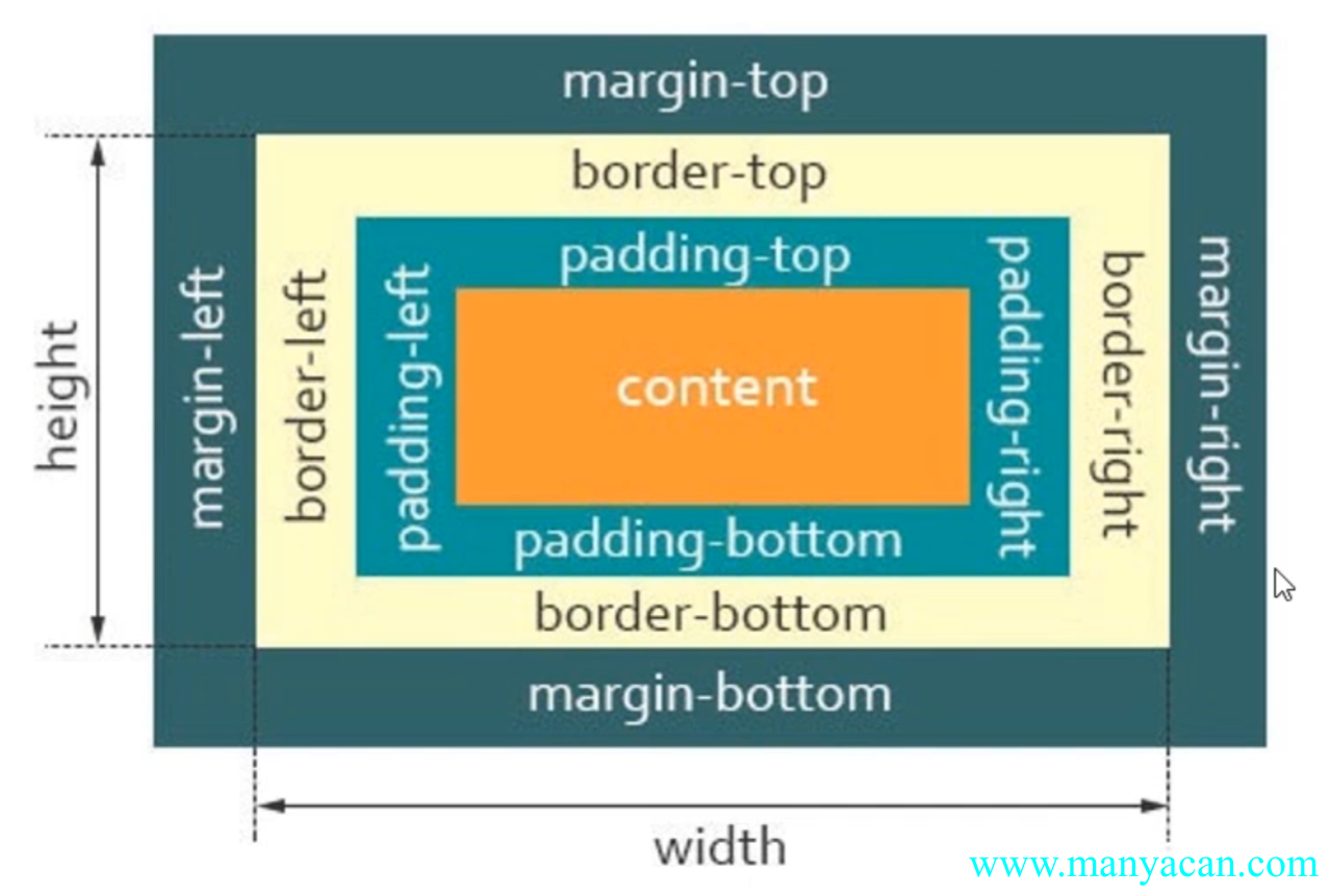
CSS盒子模型
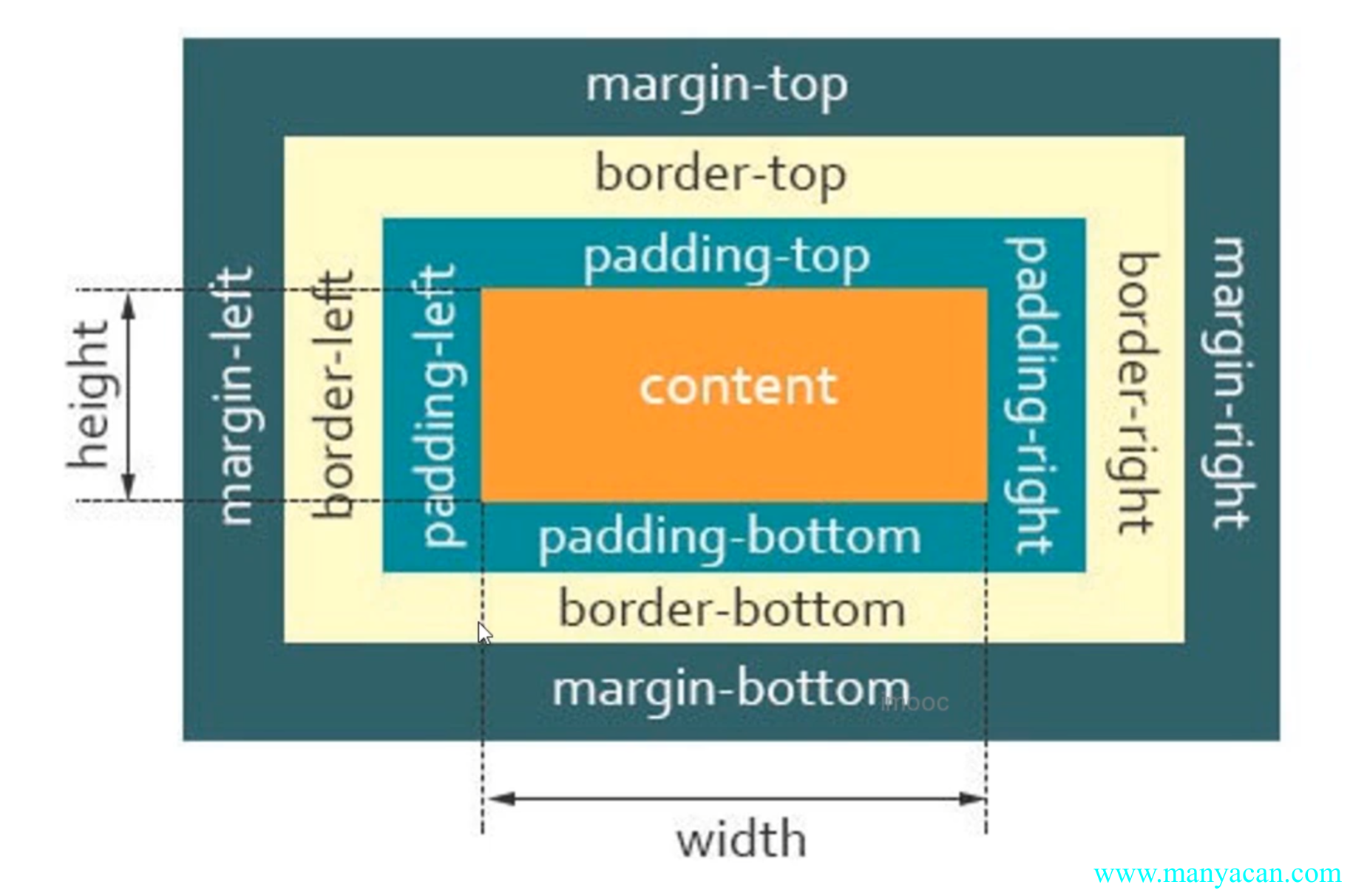
CSS盒子模型
css盒模型的注意点:
padding不能为负值,而margin可以为负值;- 背景色会平铺到非
margin的区域; margin-top传递的现象及解决方案;margin上下叠加的现象及解决方案。
3、什么是margin-top的传递现象?当父元素嵌套 子元素,给子元素添加margin-top属性的时候,会出现子元素没有效果,但是父元素却出现了margin-top。举例:
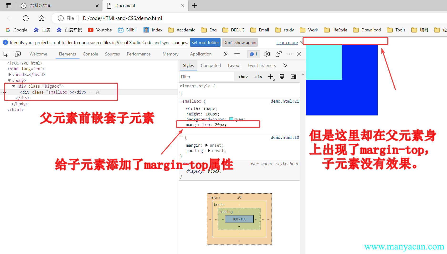
margin-top的传递现象
解决方案:
- 给父元素添加一个边框即可解决——
border-top: 1px solid rgba(0, 0, 0, 0); - “障眼法”——子元素使用
border-top: 20px solid blue; - 使用弹性布局(flex)或者网格布局(gird)。
4、margin上下叠加问题是指,当两个兄弟div,上一个设置了margin-bottom,下一个设置了margin-top,那么两个元素之间的举例并不是margin-bottom+margin-top,而是取最大值最为两者之间的距离,举个栗子:
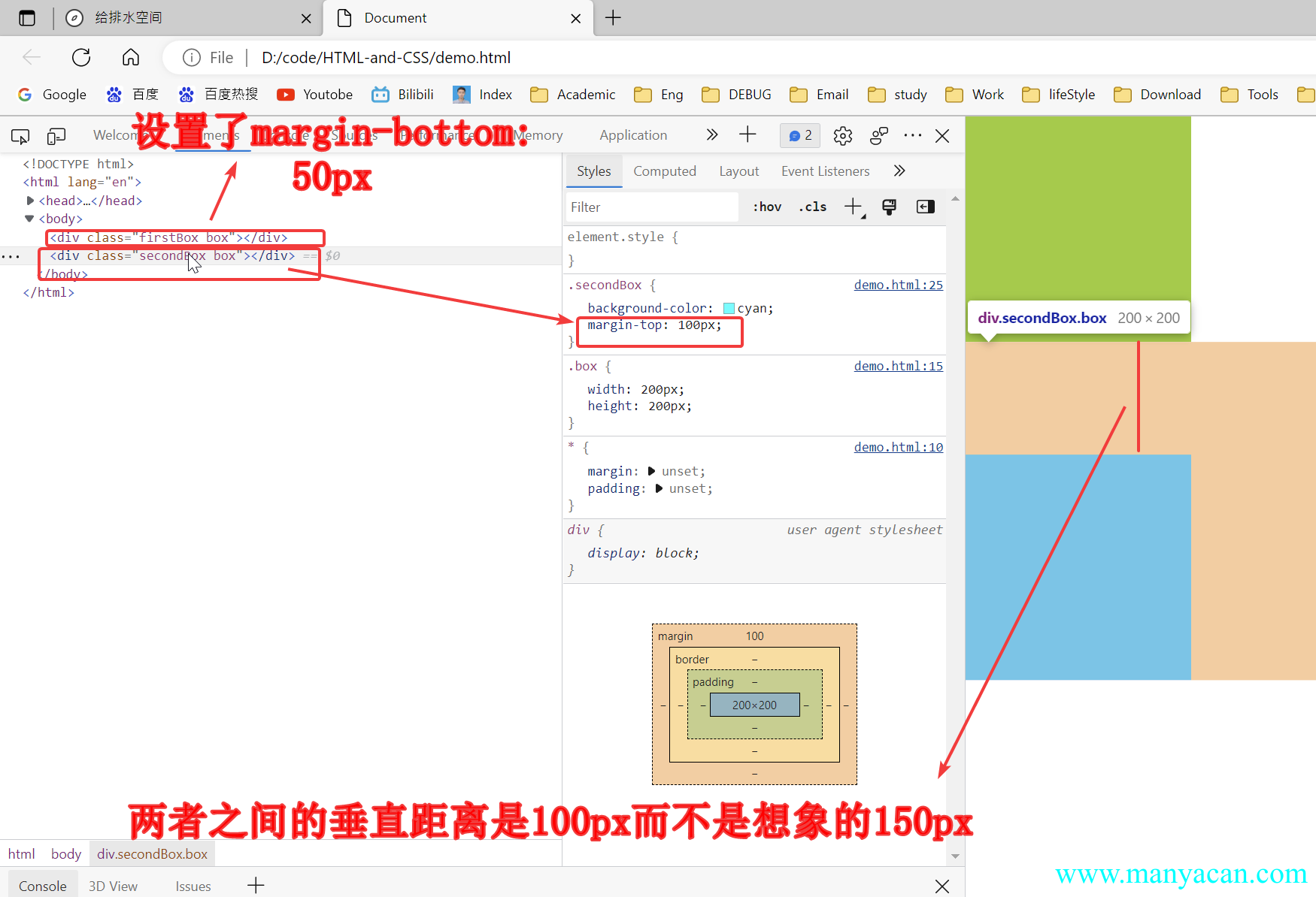
解决方案:
margin尽量设置到一个元素上;- 使用弹性布局(flex)或者网格布局(gird)。
块级盒子与内联盒子
在CSS中我们广泛地使用两种“盒子”,块级盒子(block box)和内联盒子(inline box)。这两种盒子会在页面中表现出 不同的行为方式。
- 块级盒子:
div、p、h1; - 内联盒子:
span、a、strong。
块状盒子特性
- 独占一行;
- 支持所有css样式;
- 不写宽度的时候,跟父元素的宽度相同;
- 所占区域是矩形。
内联盒子特性
- 盒子默认不会换行(一行显示);
- 有些样式不支持,例如:
width、height等; - 不写宽度的时候,宽度由内容决定;
- 所占区域不一定是矩形;
- 内联标签与标签之间是有缝隙的。
Tips / 提示 内联盒子很多样式不支持,在做布局的时候应尽量避免去使用。
自适应盒模型的特性
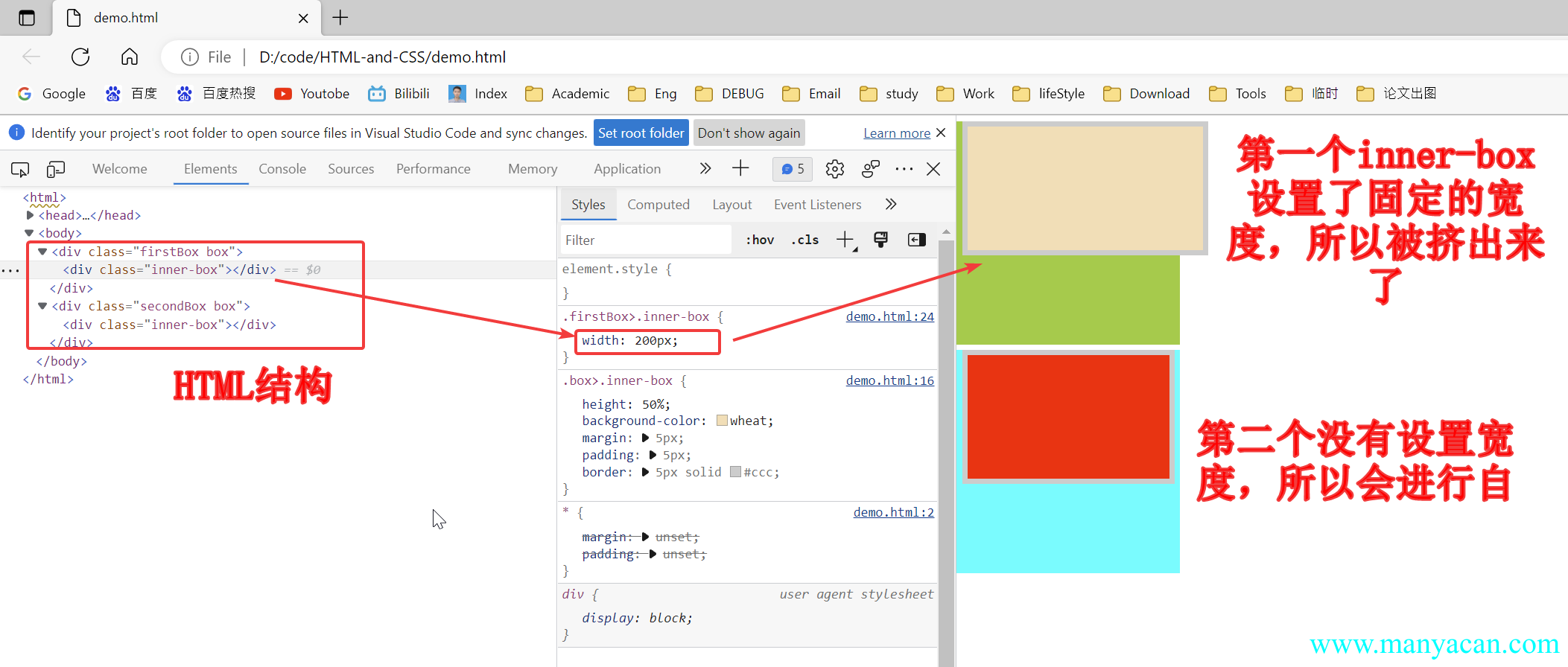
自适应盒模型指的是:当盒子不设置宽度时,盒模型相关组成部分的处理方式是如何的。
当父元素嵌套子元素,子元素设置了固定宽度(具体的px值或者%),子元素的margin、padding、border都会将元素“向外扩张”;但是如果子元素不设置width,或者width: initial,这个时候子元素会自动考虑margin、padding、border。举个栗子:
标准盒模型与怪异盒模型
在标准模型中,如果你给盒设置width和height,实际设置的是content box。padding和border再加上设置的宽高一起决定整个盒子的大小。
在怪异模型中,所有宽度都是可见宽度,所以内容宽度是该宽度减去边框和填充部分。
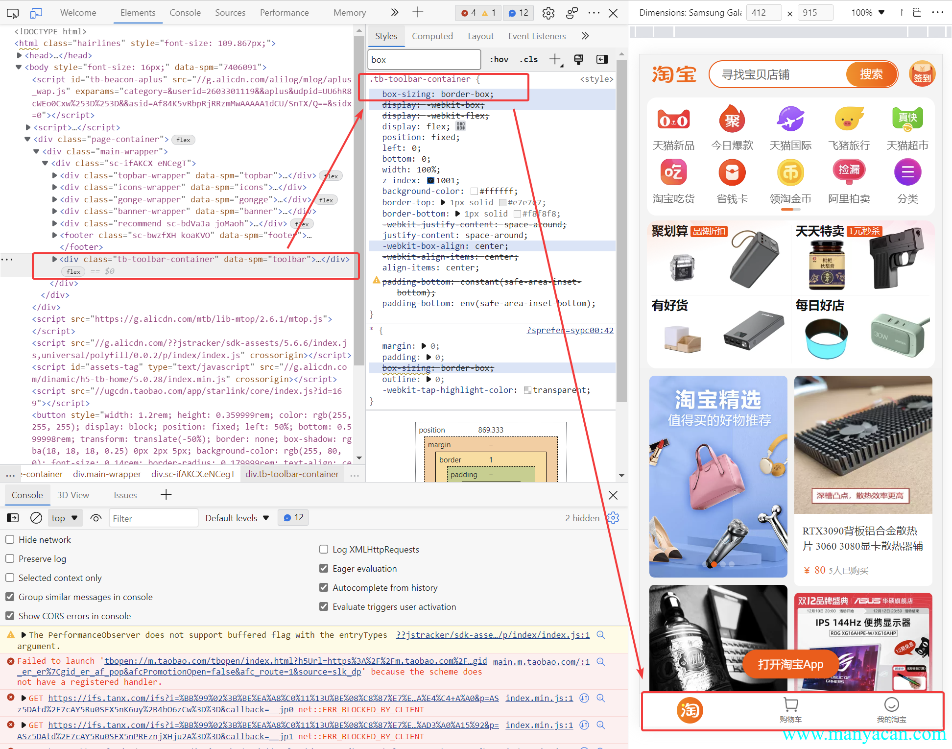
如何将标准盒模型转化为怪异盒模型?通过设置属性:box-sizing: border-box来实现。
box-sizing属性:
- content- box: width、height → content
- border-box: width、height → content + padding + border
应用:
- 量取尺寸时不用再去计算一些值;
- 解决一些需要设置百分比和盒模型值。
淘宝移动端应用实例
浮动
样式讲解
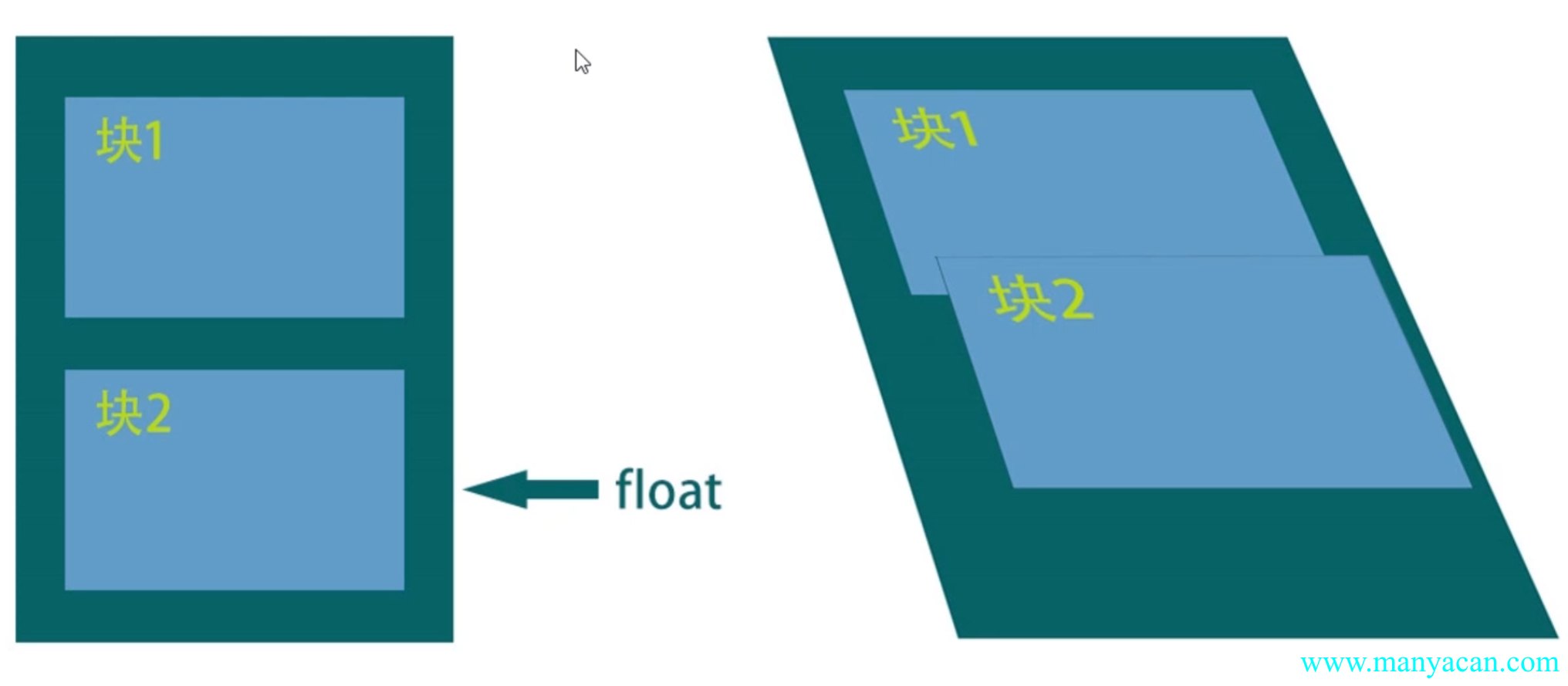
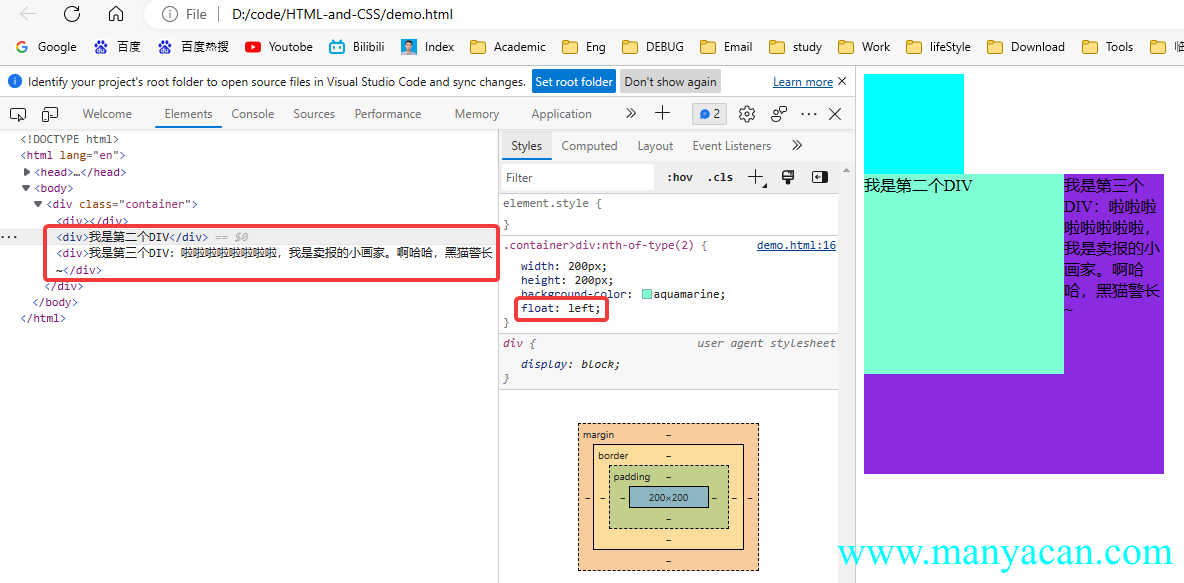
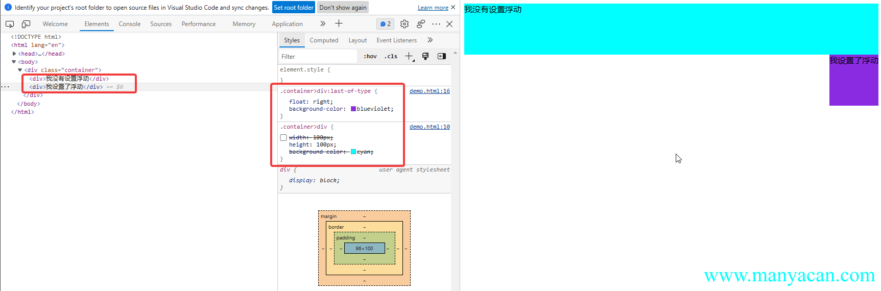
当元素被浮动时,会脱离文档流,根据float的值向左或向右移动,直到它的外边界碰到父元素的内边界或另一个浮动元素的外边界为止,是CSS布局中实现左右布局的一种方式。
文档流:文档流是元素在Web页面上的一种呈现方式,按照出现的先后顺序进行排列。
float属性
清除浮动的方案
clear属性:left、right、both三个属性值,用于清除兄弟节点的浮动,如果是父元素嵌套了子元素,子元素有浮动,那么可以通过给子元素添加一个空的同级兄弟空元素,然后清除浮动即可达到清除子元素浮动的效果;- BFC
- 空标签
.clearfix::after{}:为浮动的元素设置一个伪类来清除浮动,不需要新增DOM元素,其本质还是方法一。
.clearFix::after{
    content: '';
    clear: both;
    display: block
}
特性注意点
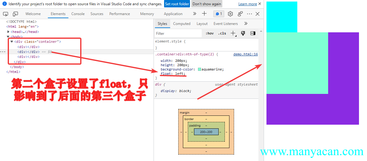
1、浮动只会影响后面的元素。
2、文字永远不会被浮动元素覆盖。
借助此特性,可以实现某些图文混排的效果。
3、块状盒子具备内联盒子特性:宽度由内容决定。
div在默认情况下是块状元素,即display: block,对于块状元素,当不设置width时,其默认值为100%,也就是等于父元素的宽度。
但是如果div设置了浮动,那么其宽度就是由内部元素的宽度所决定,这个特性和内敛盒子一样。
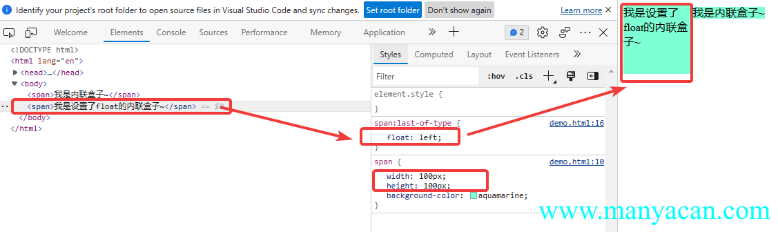
4、内联盒子具备块状盒子的特性:支持所有样式。
内联盒子是不支持块状盒子特性的,比如width属性,但是当设置了float属性后,就会支持了。
5、浮动放不下,会自动换行。
这个不用解释,其实还就是当块状盒子设置了浮动,就具备了内联盒子的特性,会自动换行。
定位样式讲解
CSS position属性用于指定一个元素在文档中的定位方式,其中top、right、bottom和left属性则决定了该元素的最终位置。
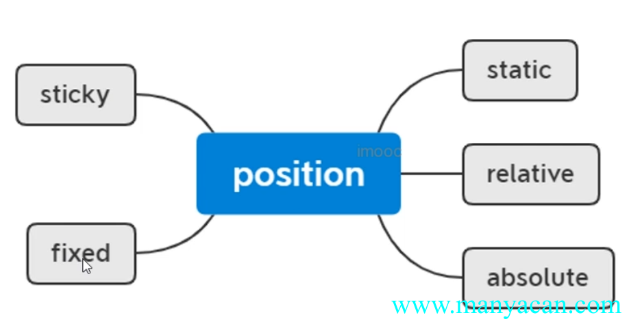
相对定位
- 相对定位的元素是在文档中的正常位置偏移给定的值(相对自身进行偏移);
- 不影响其他元素的布局。
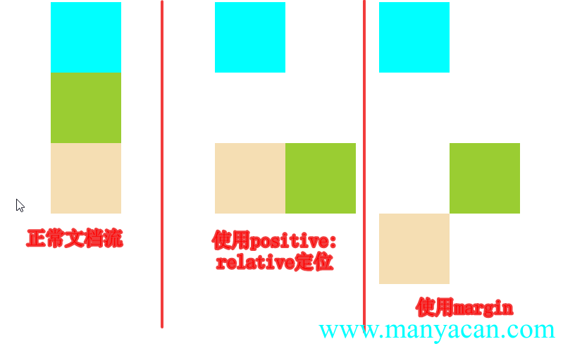
绝对定位
- 绝对定位的元素脱离了正常的文档流,绝对定位元素不占据文档流空间;
- 与使用了
float属性的div相似,具备了内联盒子的特性——在不设置width属性的时候,宽度由内容决定; - 同样,当内联盒子使用了绝对定位,可以让其具备块级盒子的特性——支持所有的样式。
Expand / 拓展 绝对定位元素相对于最近的非
static祖元素定位,当这样的祖元素不存在时,则相对于可视区域定位。
固定定位
- 固定定位与绝对定位相似,但是会固定在可视区域中;
- 不受祖元素定位方式的影响;
- 块级盒子使用了固定定位,就会具有内联盒子的特性;
- 内联盒子使用了固定定位,就会具有块级盒子的特性。
粘性定位
粘性定位可以被认为是相对定位和固定定位的混合,元素在跨越特定阈值前为相对定位,之后为固定定位。
层级的改变
使用属性z-index可以对元素的层级进行调整,默认元素的z-index值为0。
flex弹性布局
Tips / 提示
- 在线版flex布局笔记
- 一张图片搞定Flex布局
- flex 是 flexible Box 的缩写,意为"弹性布局",用来为盒状模型提供最大的灵活性,任何一个容器都可以指定为 flex 布局。
- 当我们为父盒子设为 flex 布局以后,子元素的 float、clear 和 vertical-align 属性将失效。
- flex布局又叫伸缩布局 、弹性布局 、伸缩盒布局 、弹性盒布局。
- 采用 Flex 布局的元素,称为 Flex 容器(flex container),简称"容器"。它的所有子元素自动成为容器成员,称为 Flex 项目(flex item),简称"项目"。
弹性盒子是一种用于按行或按列布局元素的一维布局方法。元素可以膨胀以填充额外的空间,收缩以适应更小的空间。
Tips / 提示 通过给父盒子添加 flex 属性,来控制子盒子的位置和排列方式。
特点:
- 操作方便,布局极其简单,移动端使用比较广泛
- pc端浏览器支持情况比较差
- IE11或更低版本不支持flex或仅支持部分
.flex-demo-13 { height: 400px; display: flex; flex-direction: column; justify-content: space-between; background-color: yellowgreen } /* 所有div内部文字居中 */ .flex-demo-13 div { display: flex; align-items: center; justify-content: center } /* Header */ .flex-demo-13>div:first-of-type { height: 10%; background-color: aquamarine; } /* Nav */ .flex-demo-13>div:nth-of-type(2) { justify-content: space-evenly; } .flex-demo-13>div:nth-of-type(2)>div { width: 15%; height: 30px; background-color: blueviolet } /* Container */ .flex-demo-13>div:nth-of-type(3) { height: 60%; } .flex-demo-13>div:nth-of-type(3)>div { width: 20%; height: 100%; } .flex-demo-13>div:nth-of-type(3)>div:first-of-type { background-color: blanchedalmond } .flex-demo-13>div:nth-of-type(3)>div:nth-of-type(2) { flex-grow: 1; background-color: #ccc; } .flex-demo-13>div:nth-of-type(3)>div:last-of-type { background-color: brown } /* Footer */ .flex-demo-13>div:last-of-type { height: 10%; background-color: chocolate }
Header
Nav1
Nav2
Nav3
Nav4
Nav5
Nav6
Container Left
Container Main
Container Right
Footer
Flex容器基本概念
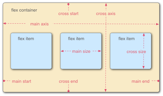
- flex container:flex容器;
- flex item:flex子项,默认沿水平横向排列;
- main axis:主轴,水平横向,开始于main start,终止于main end;
- cross axis:交叉轴,垂直竖向,开始于cross start,终止于cross end。
Flex容器设置项
flex-direction——设置主轴的方向
属性值 | 含义 |
|---|---|
row | 默认值,从左到右 |
row-reverse | 从右到左 |
column | 从上到下 |
column-reverse | 从下到上 |
在 flex 布局中,是分为主轴和侧轴两个方向,同样的叫法有 : 行和列、x 轴和y轴。默认主轴方向就是 x 轴方向,水平向右;默认侧轴方向就是 y 轴方向,水平向下。
主轴和侧轴是会变化的,就看 flex-direction 设置谁为主轴,剩下的就是侧轴,而我们的子元素是跟着主轴来排列的。
flex-warp——设置是否换行
属性值 | 含义 |
|---|---|
nowarp | 默认值,所有子项会在挤一行 |
warp | 从右到左 |
warp-reverse | 从上到下 |
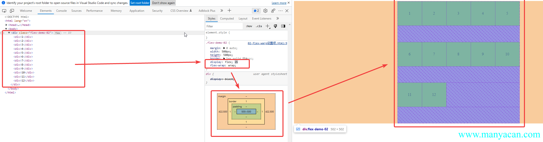
Warning / 注意 使用
flex-warp: warp,如果flex容器设置了高度,会进行等分,然后每一行元素顶着最上面;如果没有设置高度,则行与行之间会紧挨着。
flex-flow—— flex-direction 和 flex-wrap 属性的复合属性
flex-flow:row wrapjustify-content——设置主轴上的子元素排列方式
属性值 | 含义 |
|---|---|
flex-start | 默认值,从头部开始,如果主轴是x轴,则从左到右 |
flex-end | 从尾部开始排列 |
center | 在主轴居中对齐(如果主轴是x轴则水平居中) |
space-around | 平分剩余空间 |
space-between | 先两边贴边再平分剩余空间(重要) |
space-evenly | 平分剩余空间 |
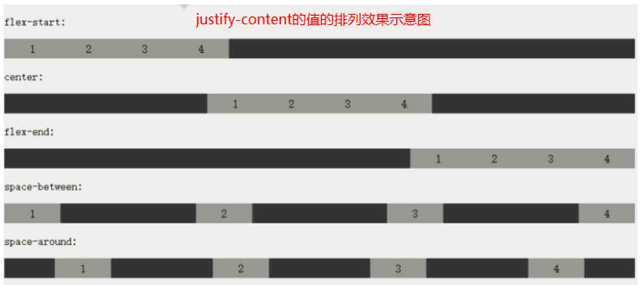
flex布局:justify-content示意图果
Expand / 拓展
space-evenly与space-around的区别,space-evenly是父容器宽度减去所有子元素宽度,然后平均分配;space-around是每个元素分配有两个边。
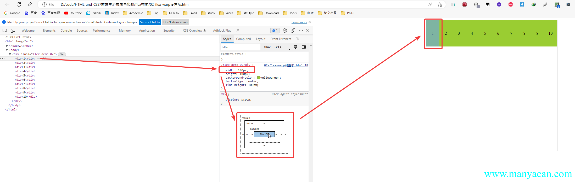
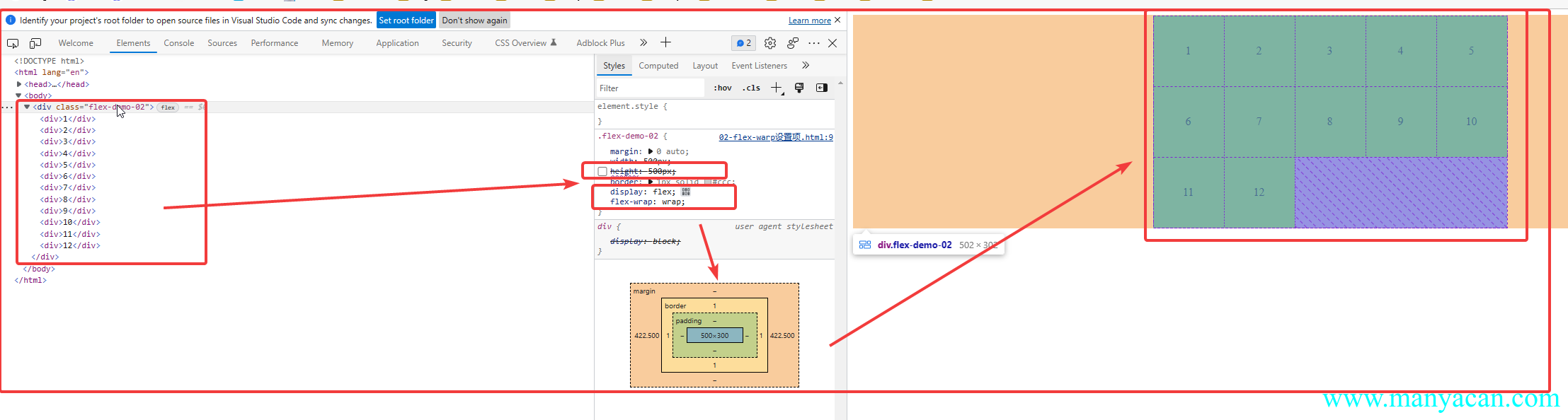
.flex-demo-02 { height: 300px; border: 1px solid #ccc; } .flex-demo-02>div { height: 50%; display: flex; justify-content: space-around; position: relative; } .flex-demo-02>div>span { position: absolute; top: 50%; left: 50%; transform: translate(-50%, -50%); font-size: 60px; } .flex-demo-02>div:last-of-type { justify-content: space-evenly; } .flex-demo-02>div>div { background-color: cyan; width: 30%; } .flex-demo-02>div>div:nth-of-type(2) { background-color: yellowgreen; } .flex-demo-02>div>div:last-of-type { background-color:tomato }
space-around
space-evenly
align-items(主轴对齐)——设置侧轴上的子元素排列方式(单行 ):
属性值 | 含义 |
|---|---|
flex-start | 从头部开始 |
flex-end | 从尾部开始 |
center | 居中显示 |
stretch | 拉伸(使用该属性时,子盒子width属性不要出现,出现时该属性无效) |
baseitems | 文字基线对齐,常用于一行显示图文,图片与文字的基线对齐 |
align-content(交叉轴对齐)——设置侧轴上的子元素的排列方式(多行)
该属性针对多行进行设置,只有当设置了
flex-warp: warp属性值的时候才会生效!!!
属性值 | 含义 |
|---|---|
stretch | 默认值,设置子项元素高度平分父元素高度 |
flex-start | 默认值在侧轴的头部开始排列 |
flex-end | 在侧轴的尾部开始排列 |
center | 在侧轴中间显示 |
space-around | 子项在侧轴平分剩余空间 |
space-between | 子项在侧轴先分布在两头,再平分剩余空间 |
space-evenly | 平分剩余空间 |
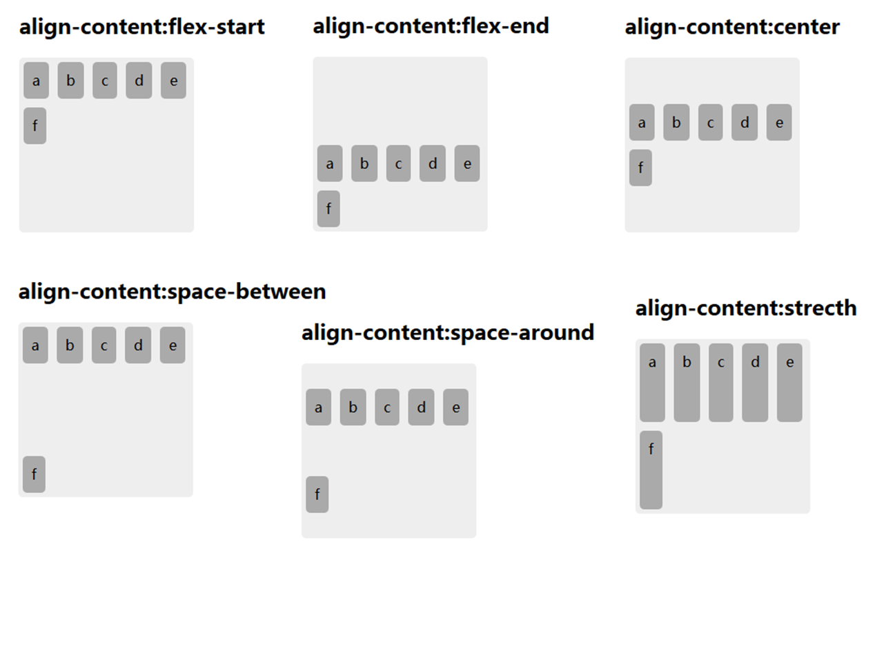
align-items适用于单行情况下, 只有上对齐、下对齐、居中和拉伸;align-content适应于换行(多行)的情况下(单行情况下无效), 可以设置 上对齐、下对齐、居中、拉伸以及平均分配剩余空间等属性值;- 总结就是单行找
align-items多行找align-content。
align-content 和align-items区别 - `align-items`适用于单行情况下, 只有上对齐、下对齐、居中和拉伸; - `align-content`适应于换行(多行)的情况下(单行情况下无效), 可以设置 上对齐、下对齐、居中、拉伸以及平均分配剩余空间等属性值; - 总结就是单行找`align-items`多行找`align-content`。
Flex容器常用布局方式
内联和块的上下左右居中布局
方法一,给父盒子设置属性:
display: flex;
align-items: center;
justify-content:center
.flex-demo-03 { height: 100px; border: 1px solid #ccc; padding: 10px 20px; display: flex; align-items: center; justify-content:center }
我是div里面的文字
方法二,对父元素和子元素分别设置,
父盒子设置属性:
display: flex子元素设置属性:
margin: auto.flex-demo-04 { height: 100px; border: 1px solid #ccc; padding: 10px 20px; display: flex; } .flex-demo-04>div { width: 100px; height: 80%; background-color: yellowgreen; margin: auto }
均分列布局
.flex-demo-05 { display: flex; justify-content: space-evenly; border: 1px solid #ccc; } .flex-demo-05>a { width: 15%; height: 3rem; border: 1px solid yellowgreen; border-radius: 5px; display: flex; align-items: center; justify-content: center; color: red; text-decoration: none; }
子项分组布局
当父元素设置为flex布局后,子元素设置属性margin-right: auto;后就会根据所有的空间进行均分。
.flex-demo-06 { display: flex; } .flex-demo-06>div { height: 20px; width: 10%; display: flex; align-items: center; justify-content: center; border: 1px solid cyan; } .flex-demo-06>div:first-of-type, .flex-demo-06>div:nth-of-type(3) { margin-right: auto; }
1
2.1
2.2
3.1
3.2
不定向居中布局
.flex-demo-07 { height: 300px; background-color: yellowgreen; display: flex; justify-content: center; align-items: flex-end; } .flex-demo-07>div { width: 70px; height: 18px; margin-bottom: 20px; display: flex; justify-content: space-evenly; align-items: center; background-color: rgba(0, 0, 0, .3); border-radius: 9px; } .flex-demo-07>div>div { width: 10px; height: 10px; background-color: cadetblue; }
Flex子项设置项
flex-grow——扩展比例
属性值 | 含义 |
|---|---|
0 | 默认值,表示不占用剩余的空白间隙扩展自己的宽度 |
0.5 | 宽度增加剩余所有空间的50% |
1 | 占满剩余的所有空间 |
大于1 | 还是占满剩余所有空间,与1效果相同 |
Warning / 注意 如果两个同级子元素(child-01、child-02)都设置了
flex-grow属性,那么会根据他们的设置值进行分配。举例说明,如果child-01设置了flex-grow: .4,child-02设置了flex-grow: .6,那么child-01扩展剩下宽度的40%,child-02扩展剩下宽度的60%;如果child-01设置了flex-grow: 4,child-02设置了`flex-grow: .6,那么child-01扩展剩下宽度的4/(4+6)=40%,child-02扩展剩下宽度的6/(4+6)=60%。
.flex-demo-08 { height: 400px; background-color: yellowgreen; display: flex; flex-direction: column; justify-content: space-between } .flex-demo-08>div { height: 23%; display: flex } .flex-demo-08>div>div { width: 20%; height: 100%; border: 2px solid cyan; background-color: violet; display: flex; align-items: center; justify-content: center } .flex-demo-08>div:nth-of-type(2)>div:last-of-type { flex-grow: .5; } .flex-demo-08>div:nth-of-type(3)>div:first-of-type { flex-grow: .4; } .flex-demo-08>div:nth-of-type(3)>div:last-of-type { flex-grow: .6; } .flex-demo-08>div:last-of-type>div:first-of-type { flex-grow: 4; } .flex-demo-08>div:last-of-type>div:last-of-type { flex-grow: 6; }
我的宽度:20%
我的宽度:20%+flex-grow:0.5
我的宽度:20%+flex-grow: .4
我的宽度:20%+flex-grow: .6
我的宽度:20%+flex-grow: 4
我的宽度:20%+flex-grow: 6
flex-shrink——收缩比例
flex-shrink与flex-grow是一对相对的属性,
属性值 | 含义 |
|---|---|
1 | 默认值,表示当子元素宽度超出flex容器时,将其宽度收缩至父元素的100% |
0.5 | 宽度减少父元素的50% |
0 | 不对flex容器中的子元素宽度进行收缩 |
大于1 | 还是宽度收缩至父元素,与1效果相同 |
注意点:如果两个同级子元素(child-01、child-02)默认情况下flex-shrink: 1,如果父元素width: 500px,child-01的width: 400px,child-02的width: 600px。那么在flex容器内,child-01的实际宽度就是:
child-02的实际宽度就是:
如果两个同级子元素(child-01、child-02),如果父元素width: 500px,child-01的width: 400px; flex-shrink: 2,child-02的width: 600px; flex-shrink: 1。那么在flex容器内,child-01的实际宽度就是:
child-02的实际宽度就是:
.flex-demo-09 { height: 200px; width: 100%; margin: 0 auto; overflow: hidden; overflow-x: auto; white-space: nowrap; } .flex-demo-09>div { margin: 0 auto; width: 500px; height: 100%; background-color: yellowgreen; display: flex; flex-direction: column; justify-content: space-between; } .flex-demo-09>div>div { height: 48%; display: flex } .flex-demo-09>div>div>div { width: 400px; height: 100%; box-sizing: border-box; border: 2px solid cyan; background-color: violet; display: flex; align-items: center; justify-content: center } .flex-demo-09>div>div>div:last-of-type { width: 600px; } .flex-demo-09>div>div:nth-of-type(2)>div:first-of-type { flex-shrink: 2; }
我的宽度:200px
我的宽度:300px
我的宽度:114px
我的宽度:386px
flex-basis
没搞明白这个属性有啥实际用处
flex
是flex-grow、flex-shrink和flex-basis的缩写。
order
改变某一个flex子项的排序位置,默认值为0,如果元素设置为1,则排至最后,如果设置为负数,则排至第一位。
align-self
——控制单独某一个flex子项的垂直对齐方式,默认值是auto,其他属性值参考Flex容器设置项中的align-items属性。
Flex子项常用布局方式
等高布局
flex子元素默认高度就会与父元素等高。
.flex-demo-10 { height: fit-content; display: flex; justify-content: space-evenly; } .flex-demo-10>div { width: 45%; background-color: yellowgreen; }
测试内容
测试内容
测试内容
测试内容
测试内容
测试内容
测试内容
测试内容
测试内容
测试内容
测试内容
测试内容
测试内容
测试内容
两列与三列布局
.flex-demo-11 { height: 200px; background-color: yellowgreen; display: flex } .flex-demo-11>div { height: 100%; width: 20% } .flex-demo-11>div:first-of-type { background-color: aqua } .flex-demo-11>div:nth-of-type(2) { flex-grow: 1; background-color: cadetblue } .flex-demo-11>div:last-of-type { background-color: chocolate }
Sticky Footer布局
.flex-demo-12 { height: 400px; display: flex; flex-direction: column } .flex-demo-12>div { height: 10%; display: flex; align-items: center; justify-content: center } .flex-demo-12>div:first-of-type { background-color: aqua; } .flex-demo-12>div:nth-of-type(2) { background-color: yellowgreen; flex-grow: 1; } .flex-demo-12>div:last-of-type { background-color: tomato }
Header
Container
Footer
综合案例
swiper轮播图
.flex-demo-14 { height: 300px; margin: 10px auto; background-color: yellowgreen; overflow: hidden; position: relative; } .flex-demo-14>.img-box { height: 100%; display: flex; } .flex-demo-14>.img-box>img { height: 100%; } .flex-demo-14>.switch-button { position: absolute; top: 50%; left: 50%; transform: translate(-50%, -50%); display: flex; justify-content: space-between; width: 100%; } .flex-demo-14>.switch-button>div { color: #ccc; background-color: rgba(0, 0, 0, .5); margin-left: 20px; padding: 15px; font-size: xxx-large; cursor: pointer; } .flex-demo-14>.switch-button>div:last-of-type { margin-right: 20px; } .flex-demo-14>.notice-button { position: absolute; width: 70px; height: 20px; border-radius: 20px; background-color: rgba(0, 0, 0, .5); bottom: 10px; left: 50%; transform: translateX(-50%); display: flex; align-items: center; justify-content: space-evenly; } .flex-demo-14>.notice-button>div { height: 10px; width: 10px; border-radius: 50%; background-color: #ccc; cursor: pointer; transition: all .2s; } .flex-demo-14>.notice-button>div:hover { background-color: #fff; }
<
>
grid网格布局
概念
CSS网格是一个用于web的二维布局系统。利用网格,你可以把内容按照行与列的格式进行排版。另外,网格还能非常轻松地实现一些复杂的布局。
Expand / 拓展 flex布局更适用于一行或者一列的一维布局,grid布局则是针对行与列同时存在的二维布局。
grid容器设置项
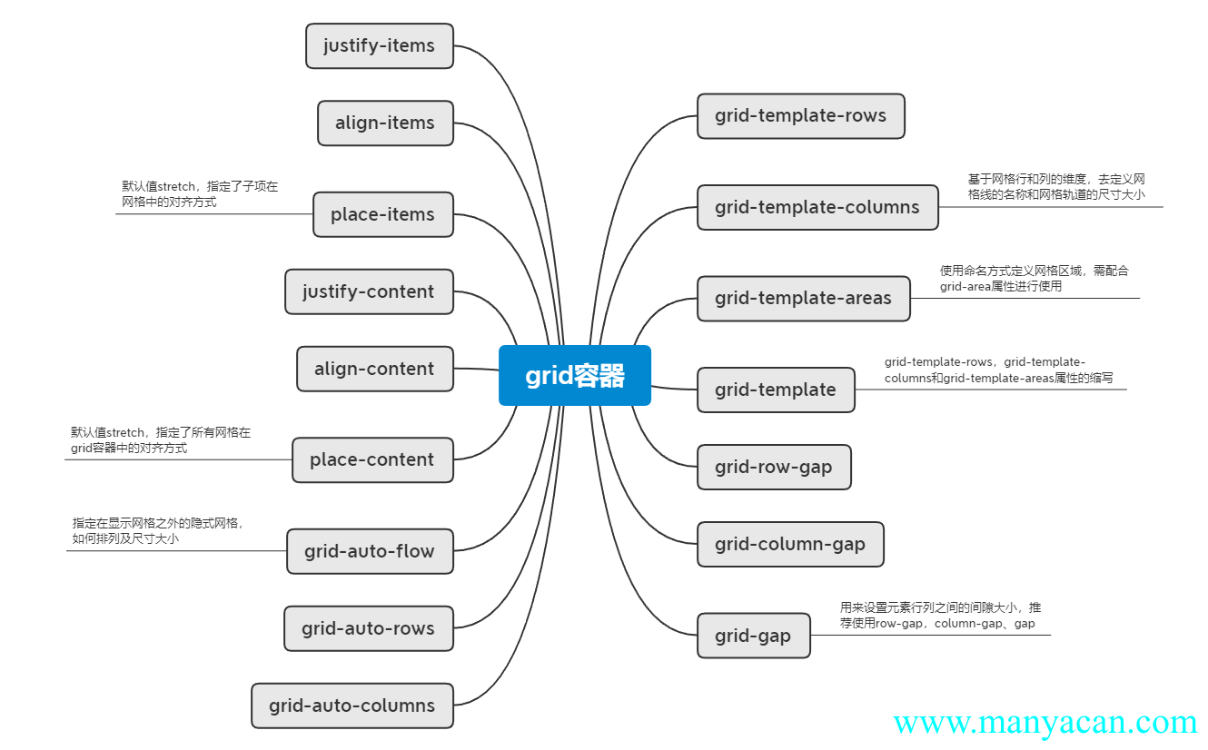
grid-template-row/columns——定义网格及fr单位
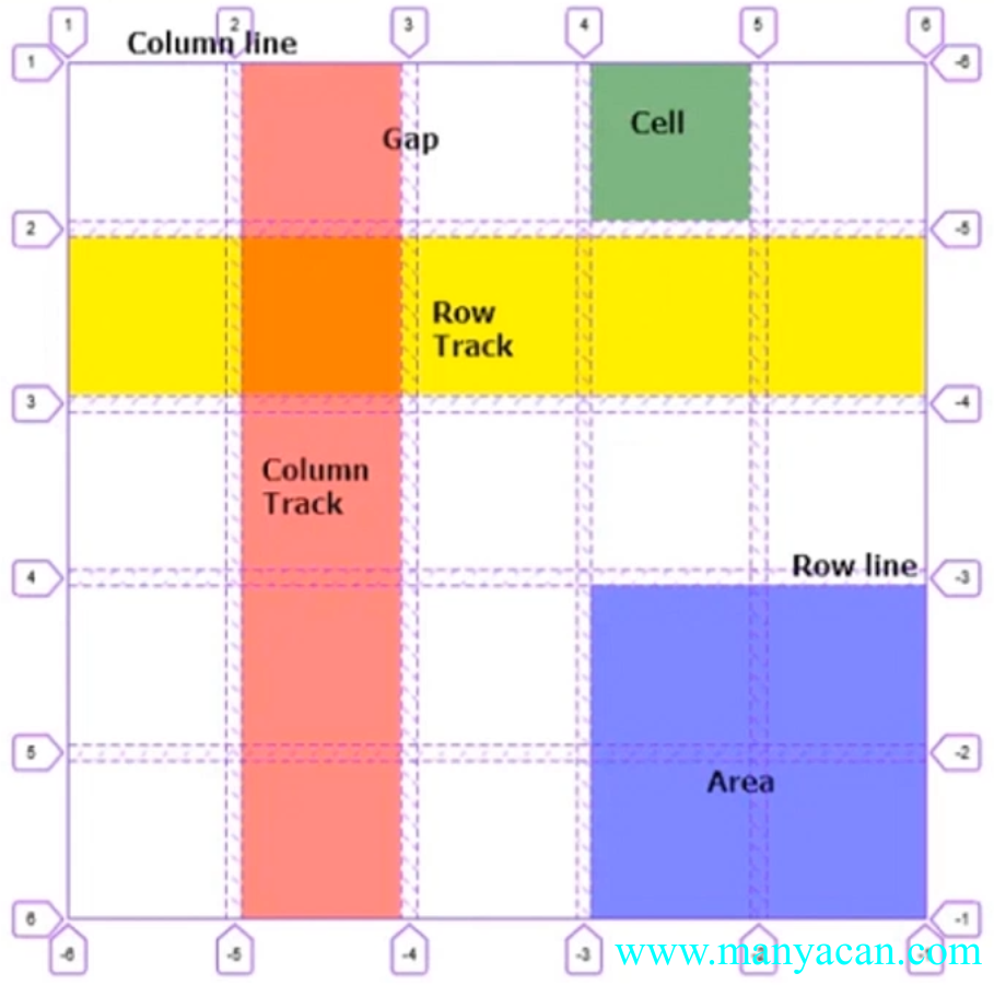
基于网格行和列的维度,去定义网格线的名称和网格轨道的尺寸大小。
display: grid;
grid-template-rows: 100px 100px 100px;
grid-template-columns: 100px 100px 100px
.grid-demo-01 { width: 300px; height: 300px; margin: 10px auto; display: grid; grid-template-rows: 100px 100px 100px; grid-template-columns: 100px 100px 100px; } .grid-demo-01>div { background-color: aquamarine; border: 1px solid #ccc; display: flex; align-items: center; justify-content: center }
1
2
3
4
5
6
7
8
9
写法还可以进行混编:
grid-template-rows: 100px 20% auto;.grid-demo-02 { width: 300px; height: 300px; margin: 10px auto; display: grid; grid-template-rows: 100px 100px 100px; /* grid-template-columns: 100px 100px 100px; */ grid-template-columns: 100px 20% auto; } .grid-demo-02>div { background-color: aquamarine; border: 1px solid #ccc; display: flex; align-items: center; justify-content: center }
1
2
3
4
5
6
7
8
9
还可以使用grid的专属单位fr:
grid-template-columns: 1fr 1fr 1fr;Tips / 提示 使用
fr的意思就是自动分配比例,例如上面的其实就等同于grid-template-columns: 100px 100px 100px。
grid-template-areas——合并网格及网格命名
使用命名方式定义网格区域,需配合grid-area属性进行使用。
对父级盒子设置:
display: grid;
grid-template-rows: 1fr 1fr 1fr;
grid-template-columns: 1fr 1fr 1fr;
grid-template-areas:
"a1 a1 a2"
"a1 a1 a2"
"a3 a3 a3";
然后再对子集元素进行命名:
.grid-demo-02>div:first-of-type {
    grid-area: a1;
}

.grid-demo-02>div:nth-of-type(2) {
    grid-area: a2;
}

.grid-demo-02>div:last-of-type {
    grid-area: a3;
}
划分子区域只能按照矩形来划分~
.grid-demo-03 { width: 300px; height: 300px; margin: 10px auto; display: grid; grid-template-rows: 1fr 1fr 1fr; grid-template-columns: 1fr 1fr 1fr; grid-template-areas: "a1 a1 a2" "a1 a1 a2" "a3 a3 a3"; } .grid-demo-03>div { background-color: aquamarine; border: 1px solid #ccc; display: flex; align-items: center; justify-content: center } .grid-demo-03>div:first-of-type { grid-area: a1; } .grid-demo-03>div:nth-of-type(2) { grid-area: a2; } .grid-demo-03>div:last-of-type { grid-area: a3; }
1
2
3
grid-template
grid-template-rows、grid-template-columns和grid-template-areas属性的缩写。
上述的父级设置就可以简写为:
grid-template:
    "a1 a1 a2" 1fr
    "a1 a1 a2" 1fr
    "a3 a3 a3" 1fr
/ 1fr 1fr 1fr;grid-row/column-gap、grid-gap——网格间隙
用来设置元素行列之间的间隙大小,grid-gap是grid-row-gap与grid-column-gap的复合简写,推荐使用row-gap、column-gap、gap。
Tips / 提示 为什么要去掉前缀
grid-?因为发现这个间隙的问题不止在grid布局中会出现,因此去掉了前缀使其也可以应用在其他布局中。
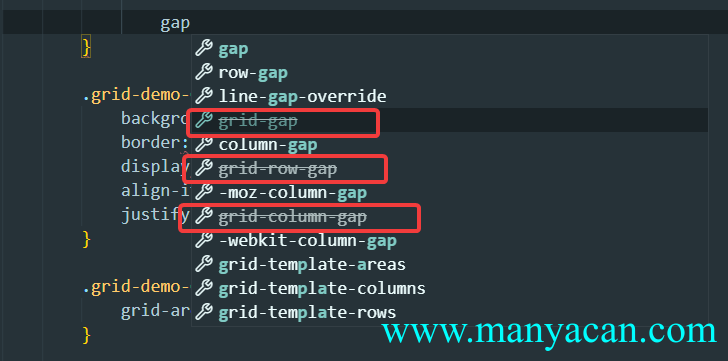
在VSC中输入gap会发现提示带有grid-前缀的属性已经过时
.grid-demo-04 { width: 300px; height: 300px; margin: 10px auto; display: grid; grid-template: "a1 a1 a2" 1fr "a1 a1 a2" 1fr "a3 a3 a3" 1fr / 1fr 1fr 1fr; gap: 10px; } .grid-demo-04>div { background-color: aquamarine; border: 1px solid #ccc; display: flex; align-items: center; justify-content: center } .grid-demo-04>div:first-of-type { grid-area: a1; } .grid-demo-04>div:nth-of-type(2) { grid-area: a2; } .grid-demo-04>div:last-of-type { grid-area: a3; }
1
2
3
gap属性在flex布局中也是可以使用的:
.grid-demo-05 { height: 100px; margin: 10px 0; background-color: yellowgreen; display: flex; justify-content: center; gap: 10px; } .grid-demo-05>div { background-color: cyan; border: 1px solid #ccc; height: 100%; width: 18%; display: flex; align-items: center; justify-content: center }
1
2
3
4
5
justify/align-items与place-items——网格对齐方式及简写
默认值stretch,指定了子项在网格中的拉伸对齐。place-items是align-items与justify-items的复合简写属性。
属性值 | 含义 |
|---|---|
start | 上/左 |
center | 中 |
end | 下/右 |
如果子元素不设置宽高,默认是铺满每一个单元格:
.grid-demo-06 { width: 300px; height: 300px; margin: 10px auto; background-color: yellowgreen; display: grid; grid-template-areas: 1fr 1fr 1fr; grid-template-columns: 1fr 1fr 1fr; gap: 10px; } .grid-demo-06>div { background-color: burlywood; border: 1px solid #ccc; display: flex; align-items: center; justify-content: center }
1
2
3
4
5
6
7
8
9
如果强制设置其宽高,会发现每一个div默认是在grid单元格的左上角对齐的:
.grid-demo-07 { width: 300px; height: 300px; margin: 10px auto; background-color: yellowgreen; display: grid; grid-template-areas: 1fr 1fr 1fr; grid-template-columns: 1fr 1fr 1fr; gap: 10px; } .grid-demo-07>div { width: 50px; height: 50px; background-color: burlywood; border: 1px solid #ccc; display: flex; align-items: center; justify-content: center }
1
2
3
4
5
6
7
8
9
align/justify-content与place-content——grid容器对齐方式及简写
指定gird容器的对齐方式,只有当grid布局的宽高小于容器宽度的时候设置才有效果。
.grid-demo-08 { width: 300px; height: 300px; margin: 10px auto; background-color: yellowgreen; display: grid; grid-template-rows: 100px 100px; grid-template-columns: 100px 100px; gap: 10px; place-items: center; place-content: center; } .grid-demo-08>div { width: 50px; height: 50px; background-color: burlywood; border: 1px solid #ccc; display: flex; align-items: center; justify-content: center; }
1
2
3
4
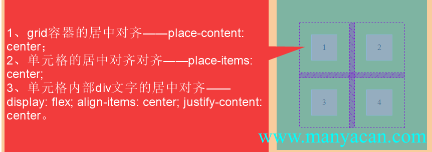
对齐方式的区别
grid-auto-flow/rows/columns——显式网格与隐式网格
指定在显示网格之外的隐式网格,如何排列及尺寸大小。什么是隐式网格?默认情况下,grid容器内部的子元素不设置宽高会自动拉伸:
.grid-demo-09 { width: 300px; height: 300px; margin: 10px auto; display: grid; grid-template-columns: 100px 100px 100px; } .grid-demo-09>div { background-color: aquamarine; border: 1px solid #ccc; display: flex; align-items: center; justify-content: center }
1
2
3
在上述栗子基础上,再增加两个子元素,并给父元素grid容器设置:
grid-template-rows: 100px;会发现第一行子元素的高度得到了限制(100px),第二行两个新加入的元素高度依旧会自适应拉伸:
.grid-demo-10 { width: 300px; height: 300px; margin: 10px auto; display: grid; grid-template-columns: 100px 100px 100px; grid-template-rows: 100px; background-color: blueviolet; } .grid-demo-10>div { background-color: aquamarine; border: 1px solid #ccc; display: flex; align-items: center; justify-content: center }
1
2
3
4
5
之所以会出现这种情况就是隐式网格在背后“作怪”,默认有个属性:
grid-auto-flow: row的意思就是出现没有进行高度设置的隐式网格的时候,隐式网格按照行进行排布。如果换成垂直布局可能更容易看出来:
.grid-demo-11 { width: 300px; height: 300px; background-color: blueviolet; margin: 10px auto; display: grid; grid-template-rows: 100px 100px 100px; grid-template-columns: 100px; } .grid-demo-11>div { background-color: aquamarine; border: 1px solid #ccc; display: flex; align-items: center; justify-content: center }
1
2
3
4
5
这个时候会发现,多出来的两个元素被挤出了第一列,这就是因为默认的隐式网格设置是row——按照行来进行自动布局,但是这个时候我们是按照列来进行布局的,所以说我们只要改变属性值为column即可:
.grid-demo-12 { width: 300px; height: 300px; background-color: blueviolet; margin: 10px auto; display: grid; grid-template-rows: 100px 100px 100px; grid-template-columns: 100px; grid-auto-flow: column; } .grid-demo-12>div { background-color: aquamarine; border: 1px solid #ccc; display: flex; align-items: center; justify-content: center }
1
2
3
4
5
上面的案例可以看出,当有隐式网格时,其默认宽度或者高度是直接进行拉伸,那么如何给默认的隐式网格设置一个固定的高度呢?
.grid-demo-13 { width: 300px; height: 300px; background-color: blueviolet; margin: 10px auto; display: grid; grid-template-rows: 100px 100px 100px; grid-auto-columns: 100px; grid-auto-flow: column; } .grid-demo-13>div { background-color: aquamarine; border: 1px solid #ccc; display: flex; align-items: center; justify-content: center }
1
2
3
4
5
上面这个案例,并没有进行grid-template-columns: 100px 100px的设置,但是却每一个元素的高度都是100px,这是因为我们设置了grid-auto-columns: 100px——如果元素没有设置固定高宽或者高度,其默认情况下会进行自适应拉伸占满gird,但是如果我们设置了grid-auto-columns,就会根据其设置的值进行解析。
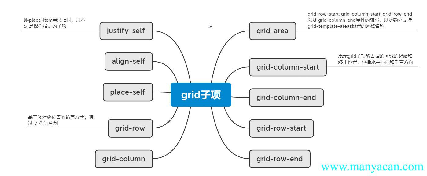
grid子项设置项
grid-column/row-start/end——基于线的元素放置
表示grid子项所占据的区域的起始和终止位置,包括水平方向和垂直方向。
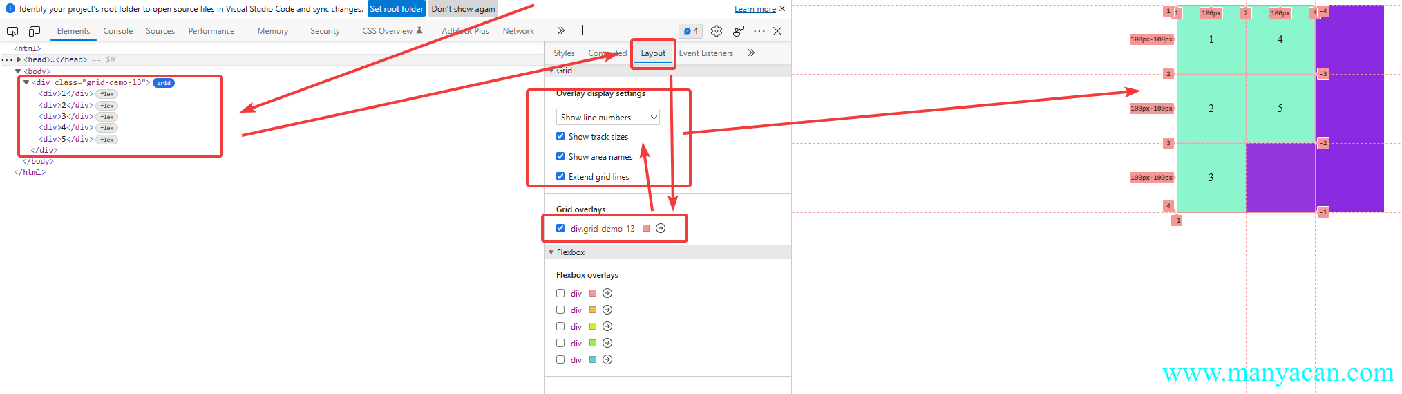
浏览器调试窗口显示grid子元素名称和分割线的序号
grid-column/row-start/end的设置方式有两种,第一种:
grid-column-start: 2;表示这个子元素从第二列开始布局,第二种:
grid-column-end: span 2;
/* 等同于grid-column-end: 4; */
表示这个子元素占有两个网格位置。
.grid-demo-14 { width: 300px; height: 300px; background-color: blueviolet; margin: 10px auto; display: grid; grid-template-columns: 100px 100px 100px; grid-auto-rows: 100px; } .grid-demo-14>div { background-color: aquamarine; border: 1px solid #ccc; display: flex; align-items: center; justify-content: center } .grid-demo-14>div:first-of-type { grid-column-start: 2; grid-column-end: span 2; /* grid-row-end: 2; */ }
grid-column-start: 2; grid-column-end: span 2;
2
3
4
上面的栗子中,第一个元素从第二列开始布局,那么第一个位置就空了出来,这是因为这个元素的默认属性grid-row-end: auto;,如果我们将其改为1(也就是这个子元素的布局在第一行就结束),那么后面的元素就会自动向前补充它的位置。
Quote / 参考 好像属性值设为任何一个数字都可以达到这个效果~
.grid-demo-15 { width: 300px; height: 300px; background-color: blueviolet; margin: 10px auto; display: grid; grid-template-columns: 100px 100px 100px; grid-auto-rows: 100px; } .grid-demo-15>div { background-color: aquamarine; border: 1px solid #ccc; display: flex; align-items: center; justify-content: center } .grid-demo-15>div:first-of-type { grid-column-start: 2; grid-column-end: span 2; grid-row-end: 1; }
grid-column-start: 2; grid-column-end: span 2;
2
3
4
grid-row是grid-row-start与grid-row-end的复合简写,grid-column是grid-column-start与grid-column-end的复合简写。grid-column: 2 / span 2等于grid-column-start: 2; grid-column-end: span 2;。
grid-area是grid-row-start、grid-column-start、grid-row-end以及grid-column-end属性的缩写,以及额外支持grid-template-areas设置的网格名称(使用/分隔)。
属性值除了直接使用行号或者列号进行设置,还可以借助于自定义行名、列名进行设置,grid容器设置:
grid-template-rows: [row1] 100px [row2] 100px [row3] 100px [row4];
grid-template-columns: [col1] 100px [col2] 100px [col3] 100px [col4];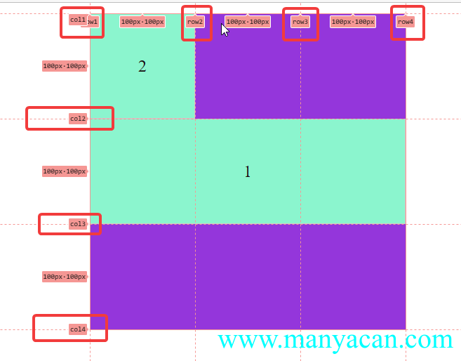
子项设置:
grid-row-start: row2;
grid-column-start: col1;justify/align/place-self——子项对齐方式
跟place-item用法相同,只不过是place-item是grid容器的属性,针对全部子元素都生效,place-self是子元素的属性,操作指定的子项。
.grid-demo-16 { width: 300px; height: 300px; background-color: blueviolet; margin: 10px auto; display: grid; grid-template-rows: [row1] 100px [row2] 100px [row3] 100px [row4]; grid-template-columns: [col1] 100px [col2] 100px [col3] 100px [col4]; } .grid-demo-16>div { width: 50%; height: 50%; background-color: aquamarine; border: 1px solid #ccc; display: flex; align-items: center; justify-content: center; justify-self: center; align-self: center; } .grid-demo-16>div:first-of-type { grid-column-start: col1; grid-column-end: span 2; }
1
2
repeat()
repeat()方法及auto-fill可选值,指定可重复的数值。
grid-template-rows: repeat(3, 100px)等价于grid-template-rows: 100px 100px 100px;。
grid-template-rows: repeat(*auto-fill*, 100px);使用auto-fill则会根据grid容器的宽度进行自动分配,防止隐式网格的产生。
minmax()
minmax()方法,设置最小和最大值的范围。
grid-template-columns: 100px minmax(100px, 1fr) 100px;设置grid容器三列,第一列、第三列宽度为100px,中间的一列最小为100px,最宽无上限(1fr)。
.grid-demo-18 { height: 300px; margin: 10px auto; background-color: yellowgreen; display: grid; grid-template-rows: repeat(auto-fill, 100px); grid-template-columns: 100px minmax(100px, 1fr) 100px; } .grid-demo-18>div { height: 100px; background-color: burlywood; border: 1px solid #ccc; /* 文字上下左右居中 */ display: flex; align-items: center; justify-content: center; }
1
2
3
4
5
6
7
8
9
grid布局案例
自适应布局
给父元素添加属性:
grid-template-columns: repeat(auto-fill, minmax(200px, 1fr)).grid-demo-19 { background-color: aquamarine; display: grid; grid-template-columns: repeat(auto-fill, minmax(200px, 1fr)); grid-auto-rows: 100px; gap: 10px 10px; } .grid-demo-19>div { background-color: violet; border: 1px solid #ccc; display: flex; align-items: center; justify-content: center; }
1
2
3
4
5
6
7
8
9
10
11
12
比定位更方便的叠加布局
.grid-demo-20 { height: 400px; background-color: aquamarine; display: grid; } .grid-demo-20 * { display: flex; align-items: center; justify-content: center; grid-area: 1/1/1/1; } .grid-demo-20>.img-box-20 { background-color: yellowgreen; background: url("https://cdn.manyacan.com/background/28.webp") no-repeat center center; /*加载背景图*/ /* 背景图不平铺 */ background-size: cover; /* 让背景图基于容器大小伸缩 */ background-attachment: fixed; /* 当内容高度大于图片高度时,背景图像的位置相对于viewport固定 */ background-color: #CCCCCC; /* 设置背景颜色,背景图加载过程中会显示背景色 */ background-position: center; } .grid-demo-20>.to-top { background-color: brown; width: fit-content; height: 30px; padding: 3px 5px; margin: 10px 20px 0 0; justify-self: end; } .grid-demo-20>.info { color: white; background-color: rgba(0, 0, 0, .5); height: 30px; line-height: 30px; align-self: end; }
Img Box
置顶 手机热卖中...
多种组合排列布局
.grid-demo-21 { height: 500px; background-color: yellowgreen; display: grid; grid-template-columns: repeat(3, 1fr); grid-template-rows: repeat(3, 1fr); gap: 5px; } .grid-demo-21>div { background-color: violet; display: flex; align-items: center; justify-content: center } .grid-demo-21>div:first-of-type { grid-area: 1 / 1 / span 2 / span 2; }
1
2
3
4
5
6
栅格布局
.grid-demo-22 { background-color: yellowgreen; display: grid; grid-template-columns: repeat(12, 1fr); grid-auto-rows: 50px; gap: 5px; } .grid-demo-22>div { background-color: springgreen } .grid-demo-22 .col-01 {grid-area: auto/auto/auto/span 1} .grid-demo-22 .col-02 {grid-area: auto/auto/auto/span 2} .grid-demo-22 .col-03 {grid-area: auto/auto/auto/span 3} .grid-demo-22 .col-04 {grid-area: auto/auto/auto/span 4} .grid-demo-22 .col-05 {grid-area: auto/auto/auto/span 5} .grid-demo-22 .col-06 {grid-area: auto/auto/auto/span 6} .grid-demo-22 .col-07 {grid-area: auto/auto/auto/span 7} .grid-demo-22 .col-08 {grid-area: auto/auto/auto/span 8} .grid-demo-22 .col-09 {grid-area: auto/auto/auto/span 9} .grid-demo-22 .col-10 {grid-area: auto/auto/auto/span 10} .grid-demo-22 .col-11 {grid-area: auto/auto/auto/span 11} .grid-demo-22 .col-12 {grid-area: auto/auto/auto/span 12}
容器自适应行列布局
.grid-demo-23 { background-color: yellowgreen; margin: 10px auto; display: flex; justify-content: space-between; } .grid-demo-23>div { width: 49%; display: grid; gap: 3px; } .grid-demo-23>div:first-of-type { grid-template-columns: repeat(3, 1fr); grid-auto-rows: 50px; } .grid-demo-23>div:last-of-type { grid-template-rows: repeat(3, 1fr); grid-auto-flow: column; } .grid-demo-23>div>div { display: flex; align-items: center; justify-content: center; background-color: violet; }
1
2
3
4
5
6
7
8
9
10
11
12
13
14
15
16
17
18
1
2
3
4
5
6
7
8
9
百度热词风云榜
.grid-demo-24 { max-width: 1000px; margin: 10px auto; border: 1px solid #ccc; padding: 10px; } .grid-demo-24>h5 { margin: 10px 0 10px 0; } .grid-demo-24>.news-box { display: grid; grid-template-columns: repeat(3, 1fr); grid-auto-rows: 100px; gap: 5px; } .grid-demo-24>.news-box>div { background-image: linear-gradient(#187fe6, #32aff2); border: 1px solid #2a9adc; display: flex; align-items: center; justify-content: center } .grid-demo-24>.news-box>div:first-of-type { grid-area: 1 / 2 / span 2 / span 2; } .grid-demo-24>.news-box>div:nth-of-type(3) { background-image: linear-gradient(#f2246c, #fe5bac); border: 1px solid #da2061; } .grid-demo-24>.news-box>div:nth-last-of-type(2) { grid-area: auto/auto/auto/span 2; } .grid-demo-24>.news-box>div:nth-of-type(n+7) { background-image: linear-gradient(#d46300, #e5ad1c); border: 1px solid #cd9818; } .grid-demo-24>.page-btn { margin-top: 20px; display: flex; justify-content: flex-end; gap: 3px; } .grid-demo-24>.page-btn>button { cursor: pointer; border: 1px solid #fe5bac; background: unset; transition: all .2s; } .grid-demo-24>.page-btn>button:hover { background-color: yellowgreen } .grid-demo-24>.page-btn>button:first-of-type { background-color: yellowgreen }
新闻热榜
1
2
3
4
5
6
7
8
1 2 3
小米商品导航菜单
.grid-demo-25 { height: 500px; display: flex; border: 1px solid #ccc; } .grid-demo-25>.nav { width: 30%; padding-left: 20px; list-style: none; display: flex; flex-direction: column; justify-content: space-evenly; position: relative; } .grid-demo-25>.nav a { color: inherit; text-decoration: none; display: block; height: 42px; line-height: 42px; width: 100%; position: relative; background-color: rgba(0, 0, 0, .3); padding: 0 10px; box-sizing: border-box; transition: all .2s; } .grid-demo-25>.nav a:hover { background-color: ff6801; } .grid-demo-25>.nav a::after { content: '>'; position: absolute; right: 10px; top: 50%; transform: translateY(-50%); } .grid-demo-25>.menu-list { flex-grow: 1; height: 100%; } .grid-demo-25>.menu-list>div { width: 100%; height: 100%; background-color: #ccc; grid-template-rows: repeat(5, 1fr); grid-auto-flow: column; display: none; transition: all .2s; } .grid-demo-25>.menu-list>div>div { border: 1px solid #ccc; background-color: tomato; display: flex; align-items: center; justify-content: center } .box-hidden { display: grid !important; }
1-商品-Demo-1
1-商品-Demo-2
1-商品-Demo-3
1-商品-Demo-4
1-商品-Demo-5
1-商品-Demo-6
1-商品-Demo-7
1-商品-Demo-8
1-商品-Demo-9
1-商品-Demo-10
1-商品-Demo-11
1-商品-Demo-12
1-商品-Demo-13
1-商品-Demo-14
1-商品-Demo-15
1-商品-Demo-16
1-商品-Demo-17
1-商品-Demo-18
1-商品-Demo-19
1-商品-Demo-20
2-商品-Demo-1
2-商品-Demo-2
2-商品-Demo-3
2-商品-Demo-4
2-商品-Demo-5
2-商品-Demo-6
2-商品-Demo-7
2-商品-Demo-8
2-商品-Demo-9
2-商品-Demo-10
2-商品-Demo-11
2-商品-Demo-12
2-商品-Demo-13
2-商品-Demo-14
2-商品-Demo-15
2-商品-Demo-16
2-商品-Demo-17
2-商品-Demo-18
2-商品-Demo-19
2-商品-Demo-20
$('.grid-demo-25>.nav a').each(function (index) { $(this).hover(function () { $('.menu-list>div:eq(' + index + ')').toggleClass('box-hidden') }) })
----- END -----
本文参与 腾讯云自媒体同步曝光计划,分享自作者个人站点/博客。
原始发表:2022-12-15,如有侵权请联系 cloudcommunity@tencent.com 删除
评论
登录后参与评论
推荐阅读
目录
腾讯云开发者

Copyright © 2013 - 2026 Tencent Cloud. All Rights Reserved. 腾讯云 版权所有
深圳市腾讯计算机系统有限公司 ICP备案/许可证号:粤B2-20090059  粤公网安备44030502008569号
腾讯云计算(北京)有限责任公司 京ICP证150476号 | 京ICP备11018762号